

This package is no longer maintained. See Recombinase for a maintained package offering similar functionality.
This package provides some macros to simplify the analysis and visualization of grouped data. It is based on the IterableTables framework (but uses IndexedTables internally) and can interface with Plots.jl for easy plotting.
To install this package simply run:
Pkg.add("GroupedErrors")at the Julia REPL.
Let's start with an example, plotting one column against another in an example database. Here school is a DataFrame, but any IterableTable is supported. The data operations are concatenated using the @> macro which GroupedErrors reexports from Lazy.jl.
using GroupedErrors
using DataFrames, RDatasets, Plots
school = RDatasets.dataset("mlmRev","Hsb82")
@> school begin
    @splitby _.Sx
    @x _.MAch
    @y _.SSS
    @plot scatter()
end
This will simply extract two columns (namely school[:MAch] and school[:SSS]) and plot them one against the other splitting by the variable school[:Sx], meaning it will actually produce two plots (one for males, one for females) and superimpose them with different colors. The @plot macro takes care of passing the outcome of the the analysis to the plot command. If not plot command is given, it defaults to plot(). However it is often useful to give a plot command to specify that we want a scatter plot or to customize the plot with any Plots.jl attribute. For example, our two traces can be displayed side by side using @plot scatter(layout = 2).
Now we have a dot per data point, which creates an overcrowded plot. Another option would be to plot across schools, namely each for each school we would compute the mean of :MAch and :SSS (always for males and females) and then plot with only one point per school. This can be achieved with:
@> school begin
    @splitby _.Sx
    @across _.School
    @x _.MAch
    @y _.SSS
    @plot scatter()
end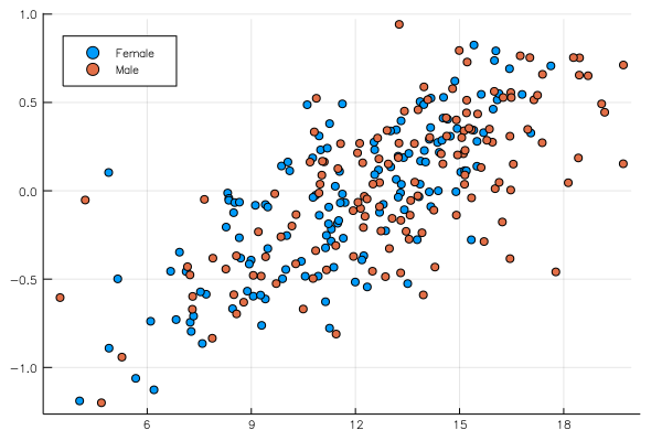
mean is the default estimator, but any other function transforming a vector to a scalar would work, for example median:
@> school begin
    @splitby _.Sx
    @across _.School
    @x _.MAch median
    @y _.SSS median
    @plot scatter()
end
One can also give a tuple of 2 functions where the second should represent the error:
using StatsBase
@> school begin
    @splitby _.Sx
    @across _.School
    @x _.MAch (mean, sem)
    @y _.SSS (mean, sem)
    @plot scatter()
end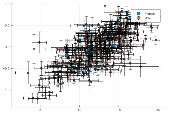
Though admittedly these data are very noisy and error bars come out huge. This analysis would look cleaner in a dataset with less groups (i.e. schools) but with more data per group.
Finally, we may want to represent this information differently. For example we may want to plot the same variable (e.g. :MAch) on the x and y axis where one axis is the value corresponding to males and the other axis to females. This is achieved with:
@> school begin
    @across _.School
    @xy _.MAch
    @compare _.Sx
    @plot scatter(axis_ratio = :equal, xlabel = "Female", ylabel = "Male",
        legend = :topleft, size = (400,450))
end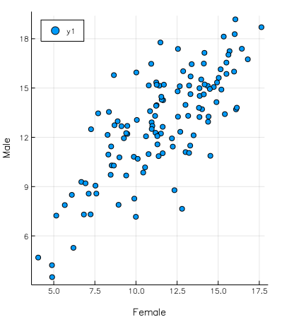
It is also possible to get average value and variability of a given analysis (density, cumulative, hazard rate and local regression are supported so far, but one can also add their own function) across groups.
As above, the data is first split according to @splitby, then according to @across (for example across schools, as in the examples in this README). The analysis is performed for each element of the "across" variable and then summarized. Default summary is (mean, sem) but it can be changed with @summarize to any pair of functions.
The local regression uses Loess.jl and the density plot uses KernelDensity.jl. In case of discrete (i.e. non numerical) x variable, these function are computed by splitting the data across the x variable and then computing the density/average per bin. The choice of continuous or discrete axis can be forced as a second argument (the "axis type") to the @x macro. Acceptable values are :continuous, :discrete or :binned. This last option will bin the x axis in equally spaced bins (number given by an optional third argument to @x, e.g. @x _.MAch :binned 40, the default is 30), and continue the analysis with the binned data, treating it as discrete.
Specifying an axis type is mandatory for local regression, to distinguish it from the scatter plots discussed above.
Example use:
@> school begin
    @splitby _.Sx
    @across _.School
    @x _.MAch
    @y :cumulative
    @plot plot(legend = :topleft)
end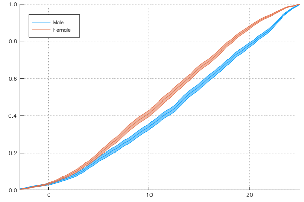
Keywords for loess or kerneldensity can be given to groupapply:
@> school begin
    @splitby _.Minrty
    @across _.School
    @x _.CSES
    @y :density bandwidth = 0.2
    @plot #if no more customization is needed one can also just type @plot
end
The bar plot (here we use @across :all to compute the standard error across all observations):
using StatPlots
@> school begin
    @splitby _.Minrty
    @across :all
    @x _.Sx :discrete
    @y _.MAch
    @plot groupedbar()
end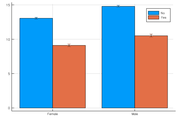
Density bar plot of binned data versus continuous estimation:
@> school begin
    @splitby _.Minrty
    @x _.MAch :binned 40
    @y :density
    @plot groupedbar(color = ["orange" "turquoise"], legend = :topleft)
end

@> school begin
    @splitby _.Minrty
    @x _.MAch
    @y :density
    @plot plot!(color = ["orange" "turquoise"], label = "")
end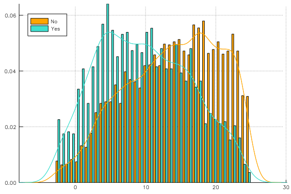
GroupedErrors allows (experimentally! use at your own risk!) aligning time varying signal using ShiftedArrays. You need to build a column of ShiftedArrays as follows. Let's say that v is your vector of signals and indices inds = [13, 456, 607] are those where meaningful event happens (assuming your dataset only have 3 rows, of course in practice inds will be much longer). You can create a column of ShiftedArrays with:
[ShiftedArray(v, -i) for i in [13, 456, 607]]and add it to your data. GroupedErrors will then be able to leverage reducing functions from ShiftedArrays to run analysis.
Let's run the following example step by step:
#load the data
using JuliaDB
df = loadtable(joinpath(Pkg.dir("GroupedErrors", "test", "tables"), "test_data.csv"))
#load the time varying signal as a 1 dimentional array
signal = vec(readdlm(joinpath(Pkg.dir("GroupedErrors", "test", "tables"), "signal.txt")))
Now, the column event gives the indices on which we want to align, So, to create a column of ShiftedArrays we do:
using ShiftedArrays
dfs = pushcol(df, :signal, [ShiftedArray(signal, -i.event) for i in df])
We are all set to plot! :subject is our grouping variable and :treatment is some variable we will use to split the data:
@> dfs begin
    @splitby _.treatment
    @across _.subject
    @x -100:100 :discrete
    @y _.signal
    @plot plot() :ribbon
end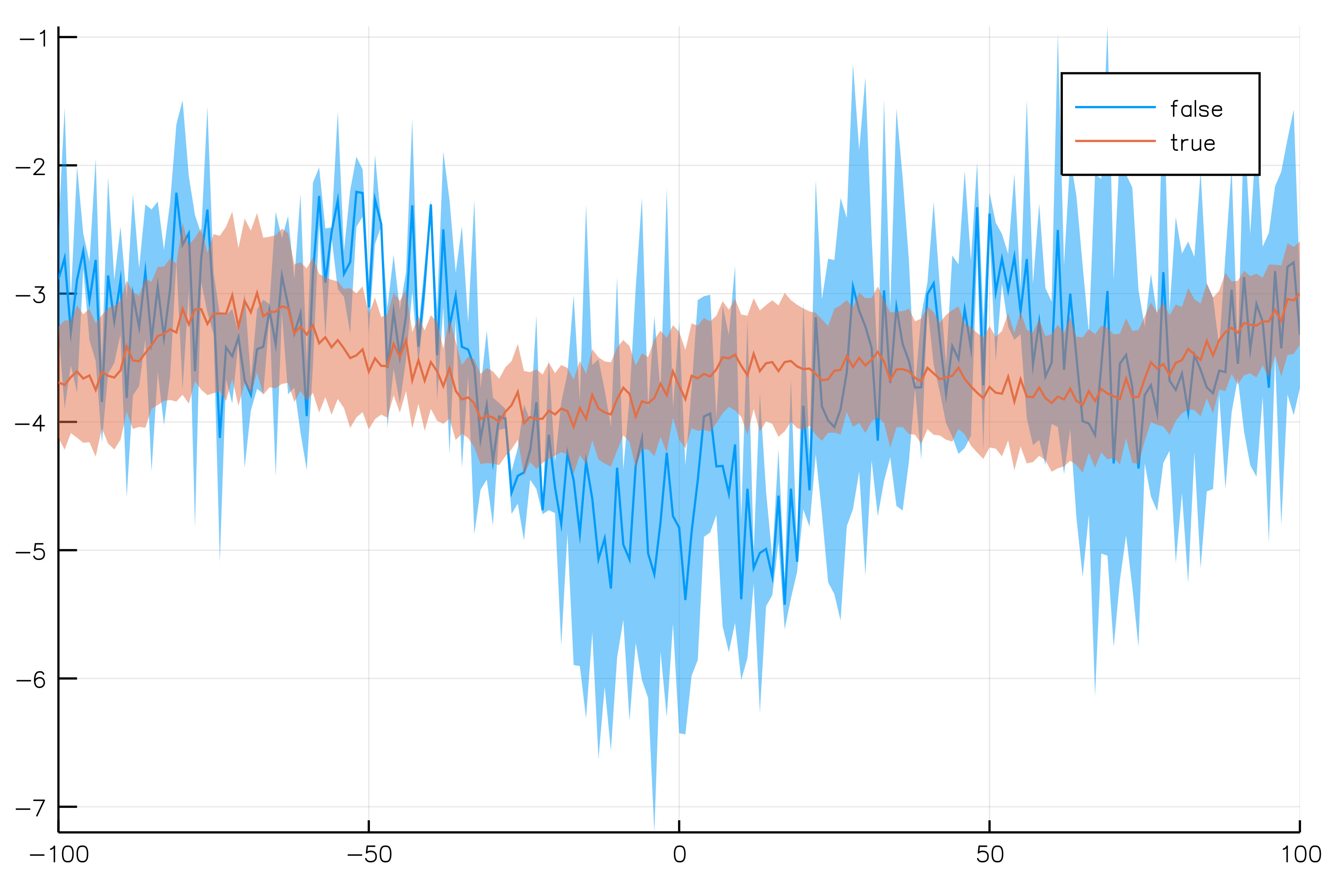
Rather than computing the variability across groups, it is also possible to compute the overall variability using non-parametric bootstrap using the @bootstrap macro. The analysis will be run as many times as the specified number (defaults to 1000) on a fake dataset sampled with replacement from the actual data. Estimate and error are computed as mean and std of the different outcomes. Example:
@> school begin
    @splitby _.Minrty
    @bootstrap 500
    @x _.CSES
    @y :density bandwidth = 0.2
    @plot
end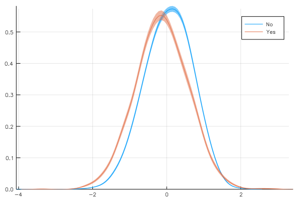
If the set of preimplemented analysis functions turns out to be insufficient, it is possible to implement new ones as a user (should they be of sufficient generality, they could then be added to the package).
For example, let's say we want to study the survival function, which is 1-cdf. Then we should define:
function survival(T, xaxis, t)
    data = StatsBase.ecdf(columns(t, :x))(xaxis)
    GroupedErrors.tablify(xaxis, 1 .- data)
end
@> school begin
    @splitby _.Sx
    @across _.School
    @x _.MAch
    @y :custom survival
    @plot
end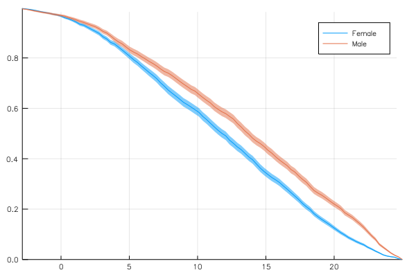
For the moment there isn't good documentation on how to create your own analysis functions but as a start you can look at this code and try and follow the same pattern as those that are implemented already.
As an experimental features, it is possible to pass attributes to plot that depend on the value of the group that each trace belong to. For example:
@> school begin
    @splitby (_.Minrty, _.Sx)
    @across _.School
    @set_attr :linestyle _[1] == "Yes" ? :solid : :dash
    @set_attr :color _[2] == "Male" ? :black : :blue
    @x _.CSES
    @y :density bandwidth = 0.2
    @plot
end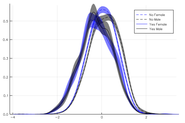
Here, the "label" of each trace we are plotting is a tuple, whose first element corresponds to the :Minrty and second element to the :Sx. With the following code, we decide to represent males in black, females in blue, minority with solid line and no-minority with dashed line. It is a bit inconvenient to use index rather than name to refer to the group but this may change when there will be support for NamedTuples in base Julia.
Sometimes it is useful to save the result of an analysis rather than just plotting it. This can be achieved as follows:
processed_data = @> school begin
    @splitby _.Minrty
    @x _.MAch :binned 40
    @y :density
    ProcessedTable
end
Now plotting can be done as usual with our plotting macro:
@plot processed_data groupedbar(color = ["orange" "turquoise"], legend = :topleft)without repeating the statistical analysis (especially useful when the analysis is computationally expensive).
Of course the amount of data preprocessing in this package is very limited and misses important features (for example data selection). To address this issue, this package is compatible with the excellent querying package Query.jl. If you are using Query.jl version 0.8 or above, the Query standalone macros (such as @filter, @map etc.) can be combined with a GroupedErrors.jl pipeline as follows:
using Query
@> school begin
    @filter _.SSS > 0.5
    @splitby _.Minrty
    @x _.MAch
    @y :density
    @plot plot(color = ["orange" "turquoise"], legend = :topleft)
endThis package supports missing data. In case of missing data, all rows with missing data in a column that is being used in the analysis will be discarded.